Top Ten Covers I Wish I Could Redesign

(TTT is a weekly meme hosted by The Broke and the Bookish)
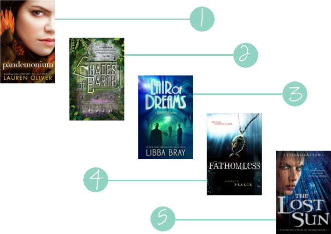
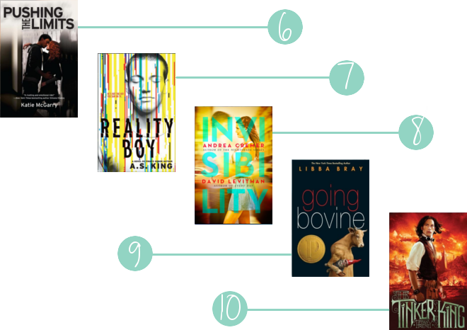
These are the top ten covers I would love to reddesign. The sad thing about these covers is that some of them are redesigns of the series and I just wish there would be a cover that fits the old style of each series.


I don’t like most of these covers because of the people. Even if they have an awesome cover concept like Invisibility or Reality Boy, I just don’t like the overall look because of the cover models.


Nadine
Oh yes the redesigning of the Across the Universe series was so stupid. Why?? Just one more book to go, why not stick with the old design?
And I often get thrown by “wrong” models on the cover. I prefer my own image of the face anyway but so often they pick models that don’t even fit the description of the protagonists!
Cee
I get incredibly mad when I look at the cover for Lair of Dreams because it will never match my hardcover copy of The Diviners. It’s incredibly hideous and that makes me sad.
I don’t like cover models either, but I’m generally fine with Reality Boy. Sort of. :P
Reviews From A Bookworm
I actually completely agree with all of these! Thankfully the Delirium series has much better covers here. Katie McGarry’s books made my list as well. My TTT.
Doris
They really should have left Shades of Earth alone!!
Check out Our TTT
Doris @ OABR
Holly
Oh Gott, ja, das Design von The Lost Sun ist so schrecklich. Jedesmal, wenn ich das Buch jemandem empfehle, hab ich das Gefühl, dass sie davon total abgeschreckt werden, dabei ist es so gut. Ich hoffe bei _dieser_ Serie echt auf ein Redesign und warte ab. Hatte es bisher nur als eBook.
PiMi
Uhhh, da hast du dir aber wirklich eine schöne “Cover-Gruselpalette” rausgesucht. Am schlimmsten finde ich “Going Bovine”, da würde ich niemals auf die Idee kommen auch nur den Klappentext zu lesen :-) Und um Across the Univers finde ich es besonders schade, denn das alte Design war echt ganz schön.