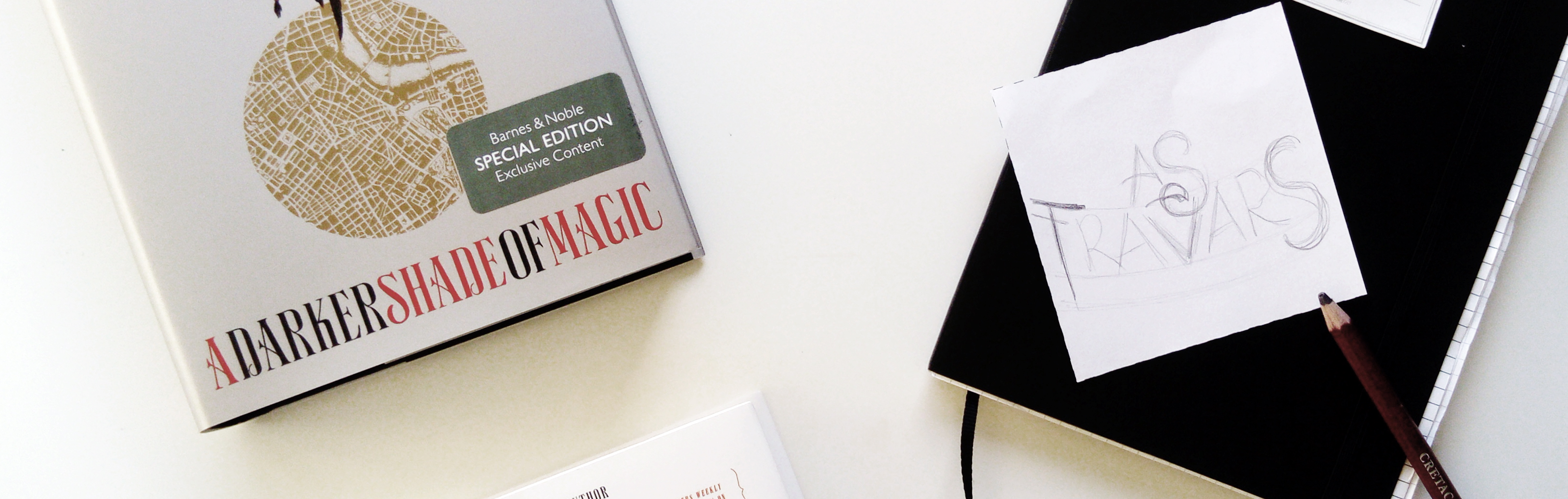
Hand Lettering: As Travars

The A Darker Shade of Magic Collector’s Edition has been out for over a month now and it still makes my day every single time I see people’s reactions to the “As Travars” lettering or coming across pictures of it on Instagram every now and then. So I guess it’s finally time to share how the lettering came to be.
First sketches
Hand lettering always starts with a sketch of the overall idea for me. Before I start thinking about what the letters should look like, I need to first figure out how to arrange the words/letters.

Before I was approached about the lettering for the collector’s edition, I already had been playing around with the quote but I never actually made a finished piece. The sketches I had from before were more about filling up space. With the idea of stickers in mind, I tried to not have a lot of white space, and forced the quote into a specific form. (To be honest, I’m glad I never finished these and were able to start a new one)
This one is another sketch that got dismissed pretty fast. While it’s the kind of word/letter arrangement I like to use a lot, it just didn’t work for this specific quote, with the T and S being so different to each other. I prefer when I can make the letters on the outside mirror each other in style which wasn’t really possible in this case.

These are the two sketches that made the basis for the actual lettering that made it onto the book. First a very simple “where do I want to put the letters” and then a second one with a little more detail. It’s hard to tell in the picture, but this is a perfect example of how I go about my lettering. I usually come up with an idea for one of the letters (in this case it was part of the R) and then try to match the others. I also already knew how I wanted the decorations to be so they connect the R and the S.
The complete hand lettered quote
Moving onto the actual lettering, I just keep drawing the letters from left to right (and tend to run out of space, but it did fit in this case^^). I do draw a lot of guiding lines to keep the letters neatly arranged though, but only very light ones so they barely show.

While this is the finished quote which I used to get a digital version, you can tell that there are still differences to the final one. The decorative bits where a bit too much and the left side of the T didn’t look good at all (not sure why I even kept that instead of already fixing it here).
Going digital
The only thing left do was actually getting a digital copy of the lettering. I used Adobe Illustrator to trace my lettering and then started making corrections to it, so that the final version ended up looking like the one you all know from the collector’s edition.

I’m pretty thankful for Society6 and Redbubble because I kind of want to put this quote on EVERYTHING. I already ordered myself a tote bag and some stickers but that sure won’t be the only things I’ll get.
Leave a Reply to Yona Schuh Cancel reply


stacee @ adventures of a book junkiee
I’m still so excited for you over this. Thanks for sharing your process…and now I need to go to RB and buy everything.
Asiya
I loved reading this process!
It’s always interesting getting this sneak peek and seeing what could have been.
Annemieke
So great to get to see your process!
Yona Schuh
Your handlettering is so cool!
I hope there will be more special editions for you to letter!