Top Ten Book Cover Elements I Like/Dislike

(TTT is a weekly meme hosted by The Broke and the Bookish)
I DO judge a book by its cover! And I don’t want a book on my shelf whose cover I don’t like.
I don’t think it’s that hard to create a pretty cover. Just don’t put any real life people, especially their faces, on the cover and you’re already near a cover I will like. My top ten six cover elements that make me LOVE a cover take a little more than that:
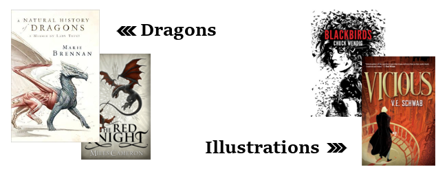
- Dragons: Put dragon on a cover and you can be sure that I want the book no matterwhat it is about. I will put that book on my to-read shelf on GR without having read a synopsis. It’s not just the promise of a story about dragons that makes me like these covers so much, but somehow dragons just always look good. A Natural History of Dragons and The Red Knight are two of my favorites with dragons on them.
- Illustrations: Victoria Schwab and Chuck Wendig always get the most awesome covers. Vicious and Blackbirds are only two of many amazing illustrated covers. I wish publishers would stick to illustrations.
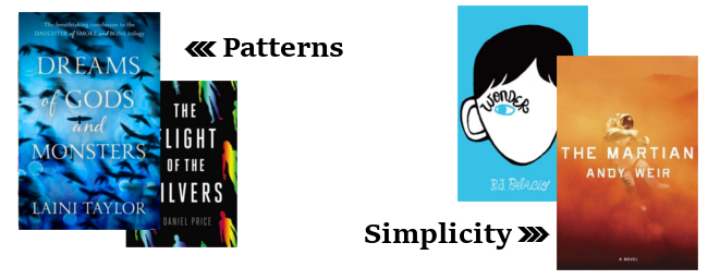
- Patterns: I LOVE the UK covers for Laini Taylor’s Daughter of Smoke and Bone series, especially the third book Dreams of Gods and Monsters. With their simple background patterns and gleam they are some of the prettiest on my shelves. The Flight of the Silvers has that gleam too! And that pattern is so simply but has the perfect look for a SciFi book.
- Simplicity: Look at that cover of The Martian! That’s an eye catcher! So simple but add some awesome colors and BAM! you’ve got an epic cover. Same goes for Wonder. Such a simple design but it perfectly mirrors the story and with that bright blue color it catches the eye so easily.
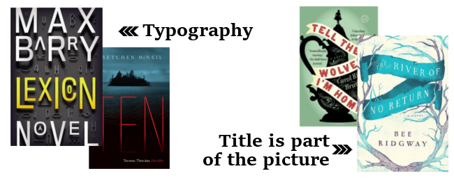
- Typography: Who needs fancy images if you can work with awesome typography!? Lexicon looks even more awesome in person! And Ten‘s font is so clean and simple and I love it.
- Title is part of the picture: I LOVE when the title is not just on top of the picture but part of it. The River of no Return is one of my favorite covers. This cover is perfection. Tell The Wolves I’m Home has the same kind of banner. Another cover like that which I really like is The Ring and the Crown where it looks like the title is under the wallpaper.
Some cover elements I don’t like:
- THE WORST: cover elements on sequels that haven’t been there before and replace the old ones :P I HATE those
- People. Dear publishers, just stop using cover models, okay? Especially the ones that have already been on a million other covers before!
- Faces. Even worse than whole people. I really don’t get who started this trend of putting faces on a cover. Do those designers really think that it looks good?
- Girls in dresses. Goes hand in hand with people but I really hate fancy dresses, especially if the MC is NEVER wearing such a dress.
Leave a Reply to crini Cancel reply


Jan Holmes
You picked some great cover artwork there, “The Martian” is really outstanding.
What I dislike about people (don’t get me started on faces) on covers is, that it doesn’t really show or say something most of the time, but it also forces the readers imagination into thinking that the MC (or somebody from the book) will look like the face on the cover. That – for me – already spoils part of the book.
Greetings, Jan
Sandra
Totally second that! :)
Hannah @ Broc's Bookcase
I am a fan of Dragon covers too, have you seen the covers for the Inheritance Series by Christopher Paolini, they made my list this week because they were all hand drawn and are beautiful. Simplicity seems to be a popular choice this week too, it made my list and I have seen it on a few others, sometimes simple is best. I never considered the title being part of the image, but seeing your examples I really like this idea, they look awesome. Great list! :)
moonglint
I’ve seen dresses on many posts today, both because people like them and dislike them. These days I need more than a pretty dress to interest me. Great list.
My TTT
Sebastian
Ich musste ja heute morgen kurz ein bisschen lachen als ich deine Liste gelesen habe, da haben wir ja fast die gleichen Punkte und teilweise sogar die gleichen Beispiele :D
Ich bin schon gespannt was das neue Chuck-Wendig-Buch diesmal für ein Cover bekommt, das wird bestimmt wieder richtig cool…
Wechselnde Gestaltungen bei Büchern einer Reihe sind auch ein absolutes No-Go, ich finde das alleine schon immer furchtbar wenn z.B. die Autorennamen auf den Buchrücken im Regal nicht einheitlich angeordnet sind :D
crini
Ich finds schon cool, dass die die Farben bei den Mookie Pearl Büchern variieren. Hoffentlich gehen denen bei denen für Miriam Black nicht die Ideen aus, wie man das Mädel noch auf dem Cover darstellen könnte XD
Mel@thedailyprophecy
I love books with illustrations :) There is something so appealing about them! I really like MG covers for that reason. Typography also works for me, it’s interesting to look at.
crini
Right! MG covers have great illustrations!